Published on Sun Sep 27 2026 13:42:38 GMT+0000 (Coordinated Universal Time) by cresencio
I Added a Search Dock to My Blog
This blog wanders. NFL predictions, wrestling, AI, website problems—whatever has my attention. An archive ordered by date makes sense, but it doesn’t always help someone find the thing they came for. A football recap and a post about a broken build can sit next to each other without having much in common.
So I added a compact search and navigation dock. It sits near the bottom of the page, keeping a few useful controls within reach: home, the blog, sections on the current page, and search.
The motion also fits a site that already has plenty of personality.
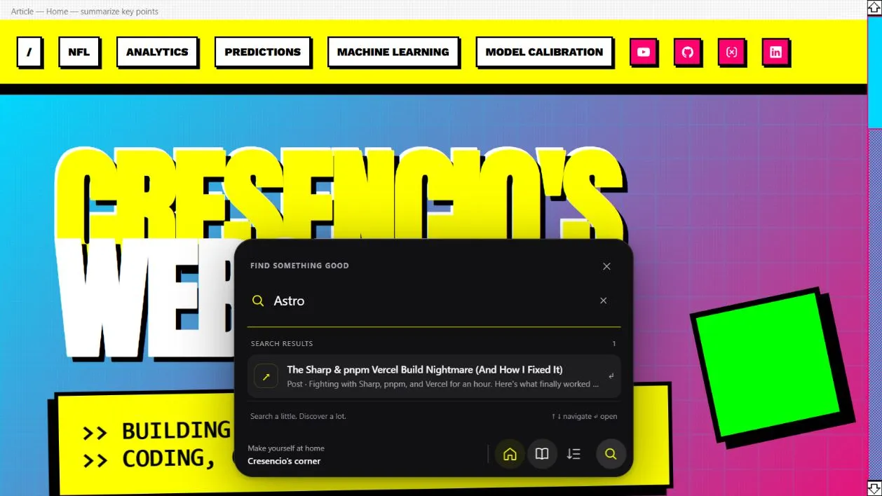
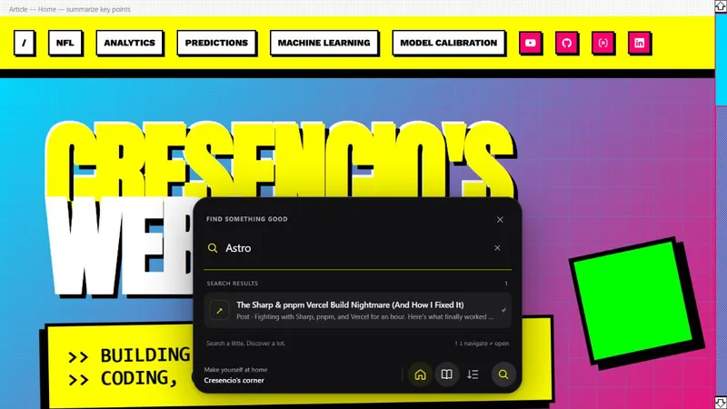
The dock in a local preview: searching for “Astro” finds an existing build-troubleshooting post.
A small bar with somewhere to go
The dock starts as a dark, rounded bar. Opening search expands it into a panel with quick links and recent posts. Start typing, and those suggestions become matching pages and articles.
You can click the search button, press Command-K or Ctrl-K, or use / when you aren’t already typing into a form. Arrow keys move through the results, Enter opens the selected one, and Escape closes the panel.
That last part is important. A shortcut should have a predictable way out.
The dock also reflects where you are. On an article, it shows the title you’re reading. On the blog page, it invites you to find your next read. The existing navigation and footer remain; this adds another way to move around.
Find a post, or find your place in one
Search and section navigation solve different problems.
Search helps you find something elsewhere on the site. The sections button helps you move around the page you’re already reading. On an article, it collects the headings and subsections into a list, adds a jump back to the beginning, and marks the current section with “You are here.”
Long football posts are a good use case. Someone might want the matchup discussion, the predictions, or the recap without scrolling through every paragraph again. The headings already describe that structure. The dock makes them easier to reach.
Those jumps use ordinary links to page anchors, preserving the browser’s address and history behavior. Keyboard focus moves to the destination, too.
There’s a small progress indicator on article pages. It estimates how far you’ve moved through the article. It can’t tell whether you actually read any of it, which seems like a reasonable limit for a line at the bottom of the screen.
Search that stays in the browser
Underneath the interface, search is straightforward. Astro builds an index of page links and non-draft posts. Each post contributes its title, description, and tags. The browser searches that index locally; typing a query doesn’t send it to a search service.
Title matches get the most weight, followed by tags and descriptions. Every word in a query has to appear somewhere across those fields. Matching ignores capitalization and accents, while punctuation is treated literally. The panel shows up to eight results and indicates when more matches exist.
That gives descriptions and tags a practical job. They help someone find a post when they remember its subject but not its exact title.
There is a tradeoff: this isn’t full-text search. It doesn’t scan every sentence in an article, correct a typo, or infer what someone meant. A detail buried in the body can be missed. For now, I’m starting with a small index and clear matching rules.
Motion, with an off switch
The dock uses the site’s yellow accent against a dark shell. Icons lift slightly toward the pointer, and the panel animates open. It’s a little bit of playfulness in a utility.
The implementation respects reduced-motion preferences, including disabling the pointer effects and animated transitions. On smaller screens, spacing and panel height adjust. It accounts for the software keyboard through the visual viewport and hides while the existing mobile menu is open.
Keyboard navigation, labeled controls, visible focus styles, and result announcements are part of the component as well. Closing the panel with its controls or Escape normally returns focus to where the interaction started. Those details give me specific behavior to check; they don’t replace testing with assistive technology and real devices.
With JavaScript disabled, the dock is hidden. The underlying page and existing navigation remain in the layout, but the dock’s search and section controls aren’t available.
Small enough to keep improving
The matching logic lives separately from the interface. Eight tests check ranking, multiword queries, accents, punctuation, ordering, limits, empty results, and missing tags. They pass. That tells me the search rules behave as tested; it doesn’t tell me how readers will feel about the feature.
The useful question now is whether the dock makes this growing collection of posts easier to explore. Search gives readers a route into the archive. Section jumps help once they’re inside an article. And the dock gets to do both without sending them back to the top of the page every time.
Try Ctrl-K or Command-K, search for a topic, and take a different route through the blog.
Written by cresencio
← Back to blog